Showroom Privé
// 2024
Overview
Redesigning Showroom Privé’s pre-purchase journey (onboarding, home, listing, product page, cart) following a major search engine migration and a visual repositioning.
The goal was to increase average basket size by simplifying product discovery and decision-making across multiple concurrent sales.
Missions
Art Direction & UI
Product Design
CRO collaboration (A/B testing)
Design system & brandbook
Executive presentations
+2M
8
+130
Concurrent sales
50k+
Daily product views
Context
Showroomprivé is a high-traffic e-commerce platform (2M+ monthly users), offering multiple private sales simultaneously.
The introduction of a new search engine, combined with a visual redesign (premium positioning), created an opportunity to rethink the entire pre-purchase experience
The project sat at the intersection of two conflicting forces:
Brand Vision:
Elevating the UI to a premium, editorial-grade experience
Business Necessity:
Maintaining the high-velocity “flash sale” urgency that drives revenue.
Through CRO analysis and live testing, we identified three main user patterns:
User behaviors
Observed from live user behavior and A/B testing
01
Scan & grab
Users quickly browse listings and purchase without accessing product pages.
02
Compare & validate
Users explore multiple product pages before making a decision.
03
Search-driven navigation
Users directly access products or sales through search, bypassing traditional entry points.
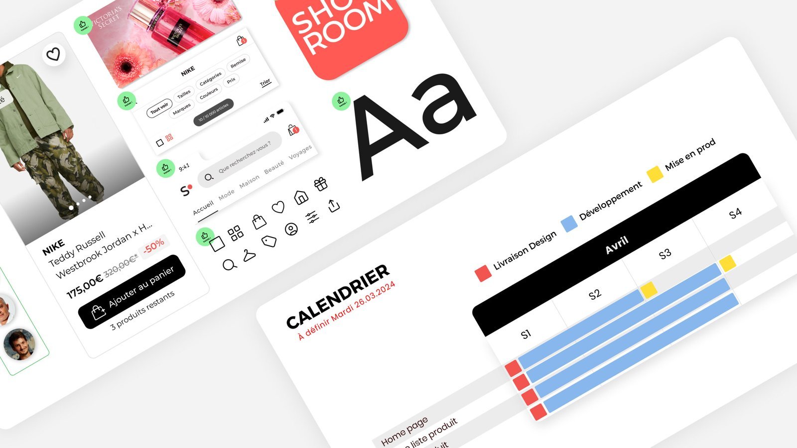
Approach
From research and UX recommendations to high-fidelity prototypes, I collaborated with product and tech teams to streamline the user flow and boost conversion.
To align a cross-functional COMEX (Executive Committee), I replaced static presentations with Interactive Decision Workshops.
Instead of viewing static mockups, stakeholders tested high-fidelity flows in real-time. This shifted the conversation from subjective opinions to objective UX observations. I used these sessions to vote on features and align Marketing, Brand, and Tech teams, reducing the validation cycle by 50%.
7
+30
1
Weekly workshop
The Challenge
Users had to navigate across multiple concurrent sales, with inconsistent entry points and fragmented decision flows.
Key issues:
- High information density
- Weak visual hierarchy
- Poor CTA visibility on mobile
- Friction between discovery and conversion
Response
We adopted a data-driven, iterative approach:
01 — Analyze user behavior
02 — Define hypotheses
03 — Design solutions
04 — Validate through A/B testing
All iterations were tested in production on large-scale traffic, in collaboration with a dedicated CRO team.
Focus
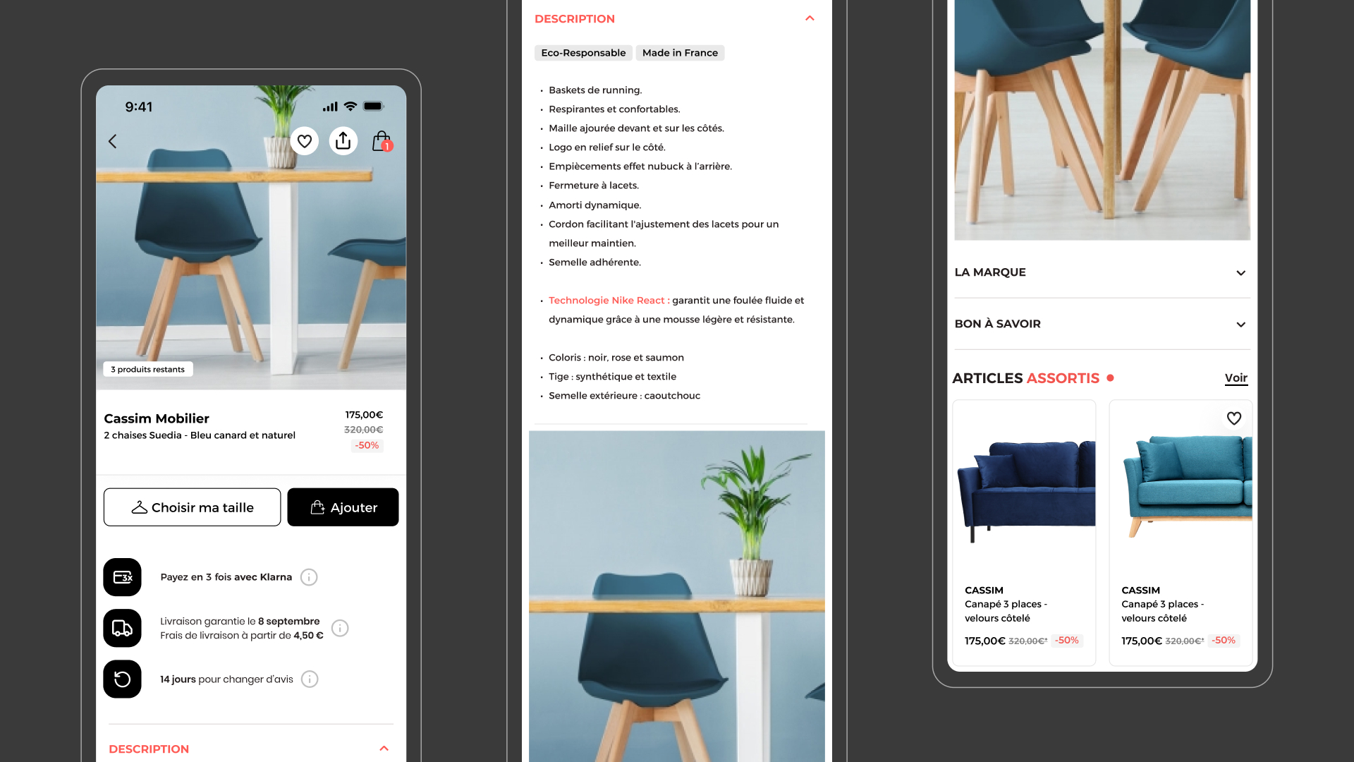
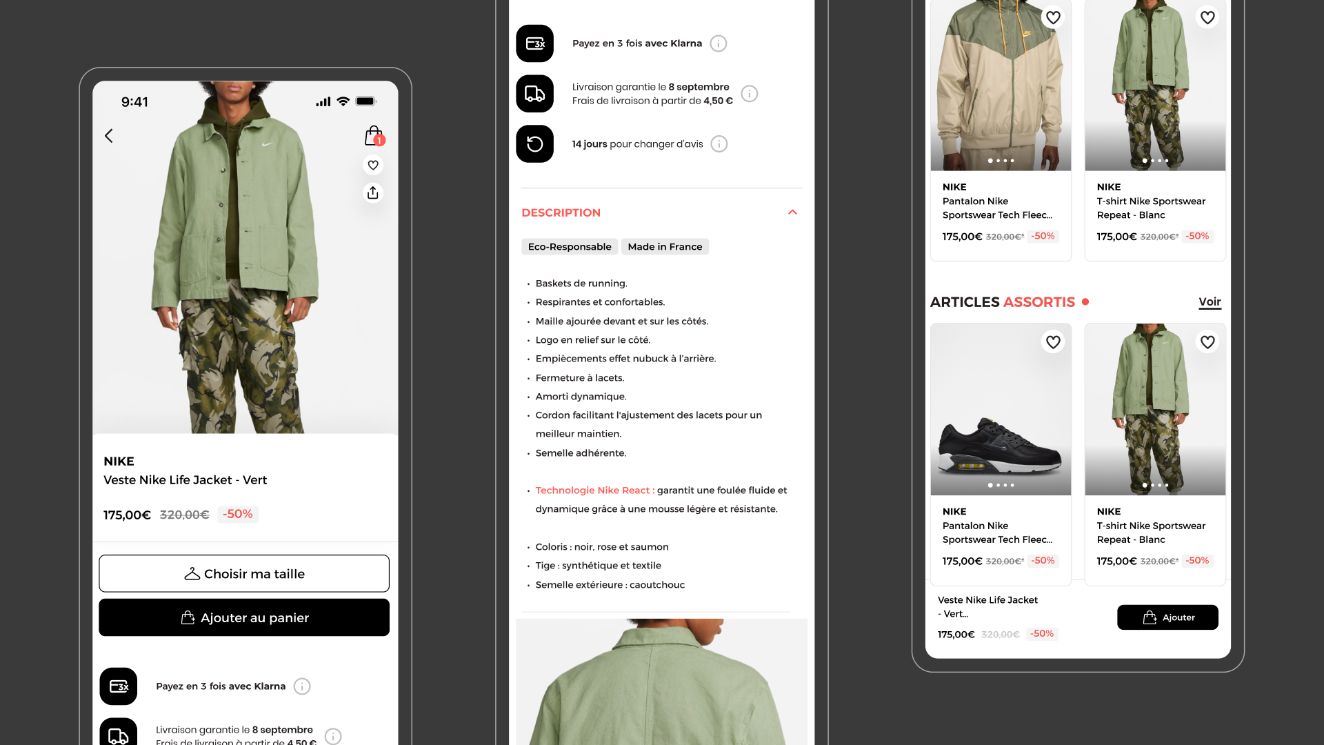
Product Page
The product page was identified as a key decision point in the journey, especially for users in a “compare & validate” behavior.
Analysis showed that:
~60% of users accessed at least one product page before purchasing
Mobile users had a higher drop-off due to friction in accessing key actions
Identified issues
Lack of visual hierarchy
Scattered information
Key decision elements not clearly visible
Difficulty scanning and comparing
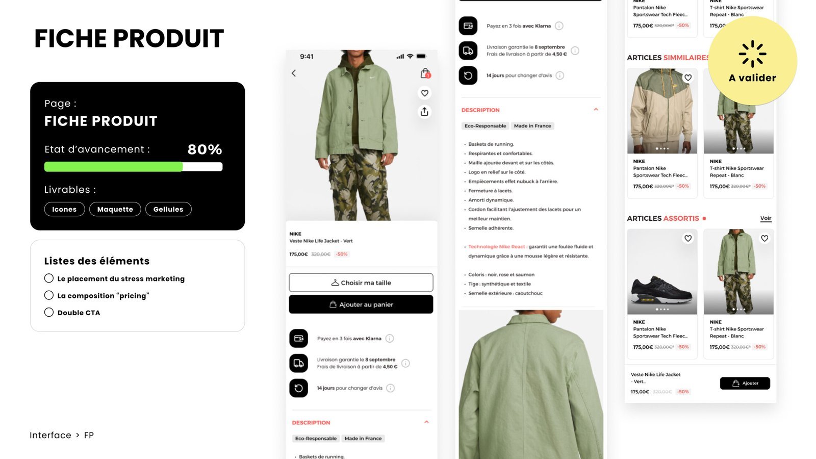
Design decisions
The goal was to reduce cognitive load and enable faster, more confident decision-making.
Simplification
We intentionally reduced information density to improve readability and decision-making, even if it meant removing certain marketing elements.
Hierarchy
We reinforced key decision drivers:
- price
- discount
- urgency (limited-time context)
- reassurance elements
Content structure
We explored different layouts:
- product-first vs brand-first
- editorial vs transactional content
Mobile optimization
- repositioned CTA
- tested sticky vs non-sticky behaviors
- improved scanability
Visual consistency
The redesign aligned UI components and visuals across the experience, reinforcing a more premium and multi-brand perception.
Impact
+12% add to cart rate (mobile)
-18% time to action
+8% product page conversion
A/B testing
Tested in production to validate product decisions at scale.
Multiple layout variations were tested in production to validate hierarchy, content positioning, and decision-making efficiency.
- dense vs simplified layouts
- hierarchy variations
- CTA positioning
- content order
These experiments allowed us to validate design decisions through real user behavior.
Results
Simplifying the layout improved decision clarity and reduced cognitive load, leading to higher conversion on tested variants.
- improved readability
- reduced cognitive load
- smoother navigation across sales
- measurable uplift in conversion on tested variants
+8%
+12%
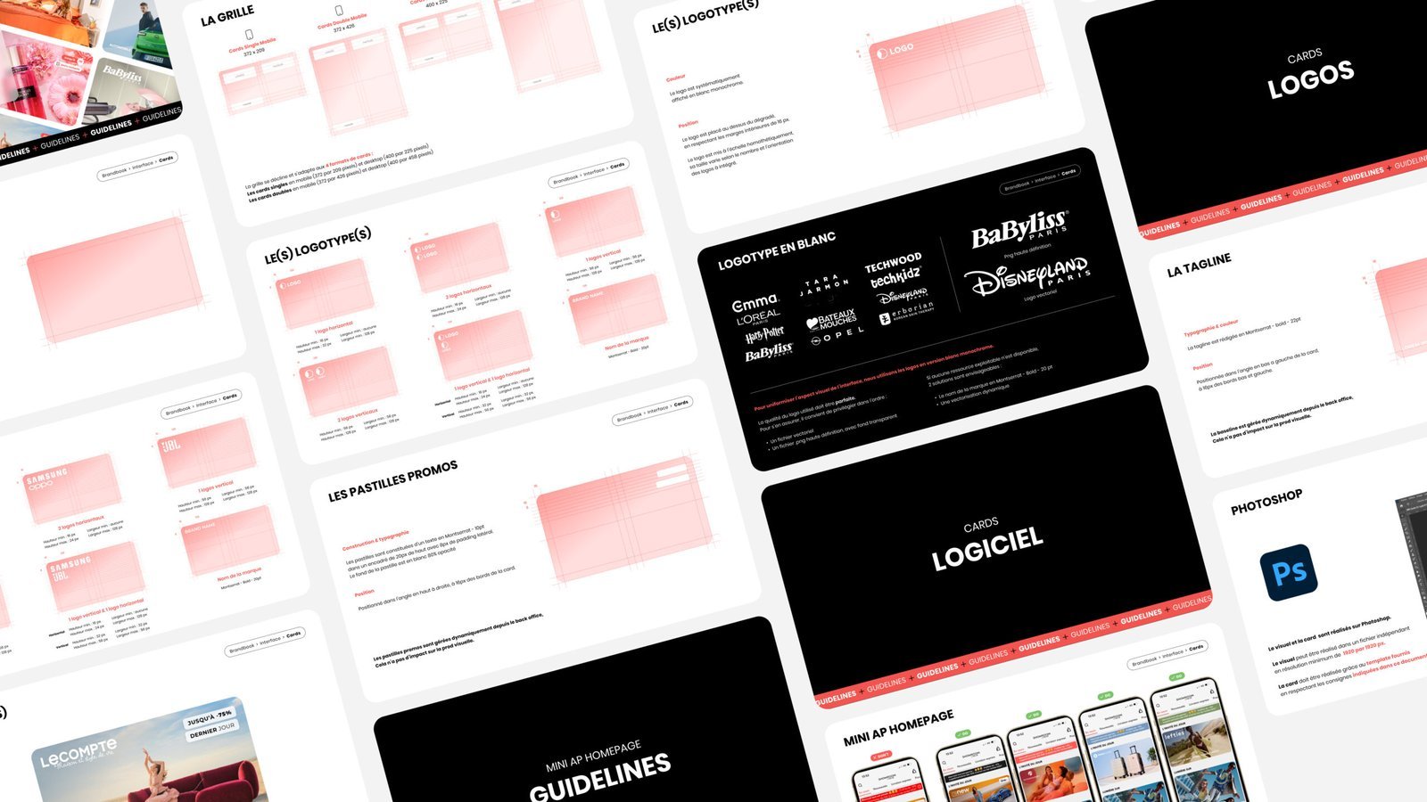
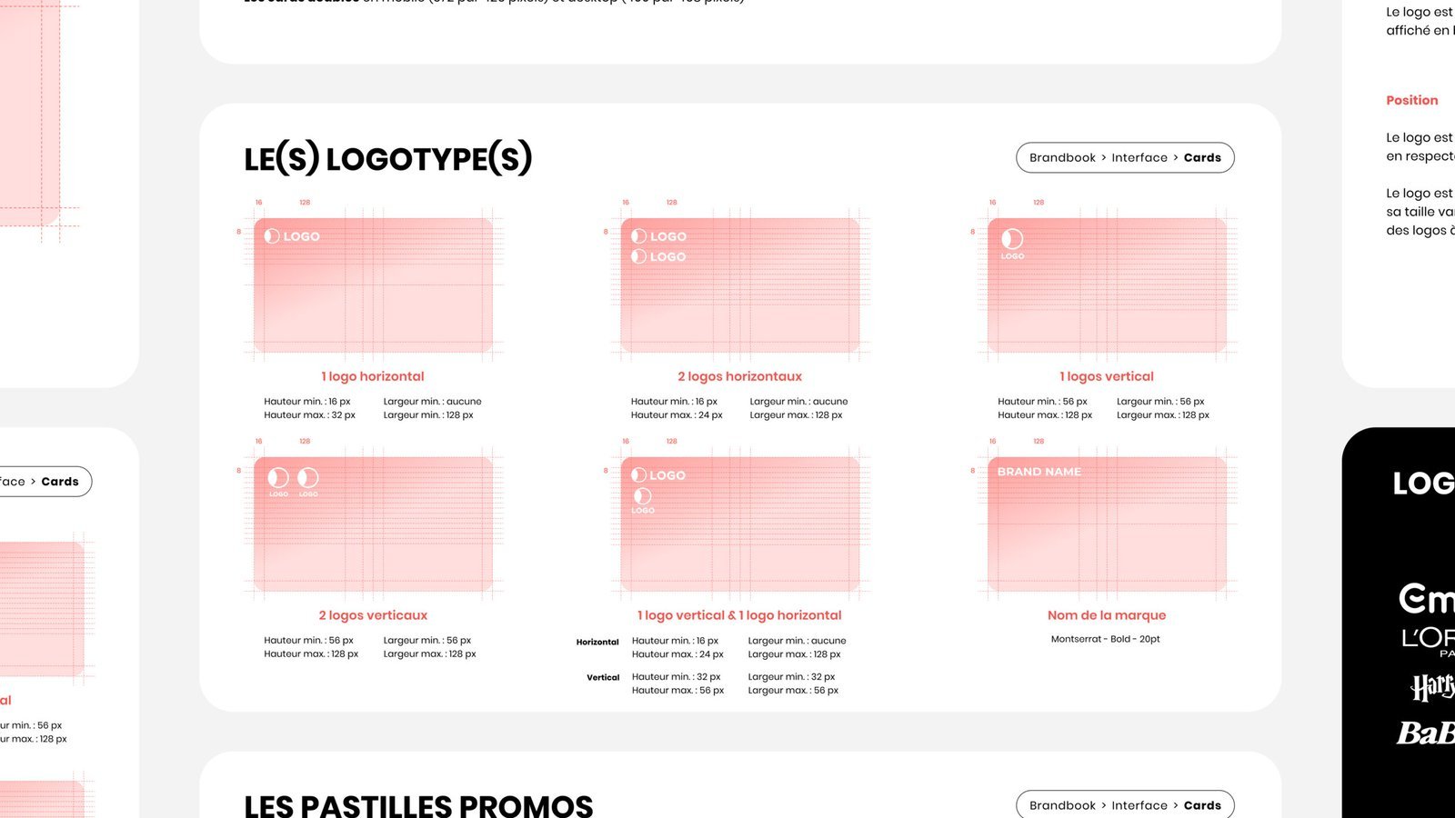
Design System
In parallel, we restructured a multi-brand design system and integrated a comprehensive brandbook.
Scope :
- 60+ reusable components
- Unified typography and spacing system
- Token-based color system
- Modular layout system
It was used across:
- product teams
- marketing
- production
- internal agency
→ ensuring consistency and scalability
-30%
+25