Dizavel Partners
// 2022
Overview
Creation of the visual identity, website, and digital tools for Dizavel Partners, a financial consulting firm founded by Antoine Fulpin.
Approach
I designed a refined and trustworthy visual system that reflects the firm’s expertise while ensuring clarity and consistency across all interfaces.
Missions
Context
Dizavel Partners, a newly formed consulting firm serving institutional clients and large enterprise accounts in strategic advisory and organizational transformation.
Challenge: Create a comprehensive brand identity and digital presence that communicated credibility, professional expertise, and institutional gravitas — essential for competing in a market where perception of stability and authority directly influences client acquisition.
Scope: Complete brand identity system, comprehensive visual guidelines, and full-featured website serving as the primary client acquisition channel.
Objectives
Institutional Credibility: Establish visual and strategic positioning that resonated with C-suite decision-makers and institutional buyers.
Professional Differentiation: Stand out in a crowded consulting landscape through distinctive visual identity and clear value proposition.
Digital Presence: Build a website that functioned as a 24/7 business development tool — converting visitor interest into qualified leads.
Brand Consistency: Create a scalable system supporting expansion across multiple service lines and geographic markets.
Role & Responsibilities
As lead designer (via Studio63), I owned the complete brand strategy and execution:
Brand Strategy & Positioning: Developed messaging and visual direction aligned with institutional market expectations
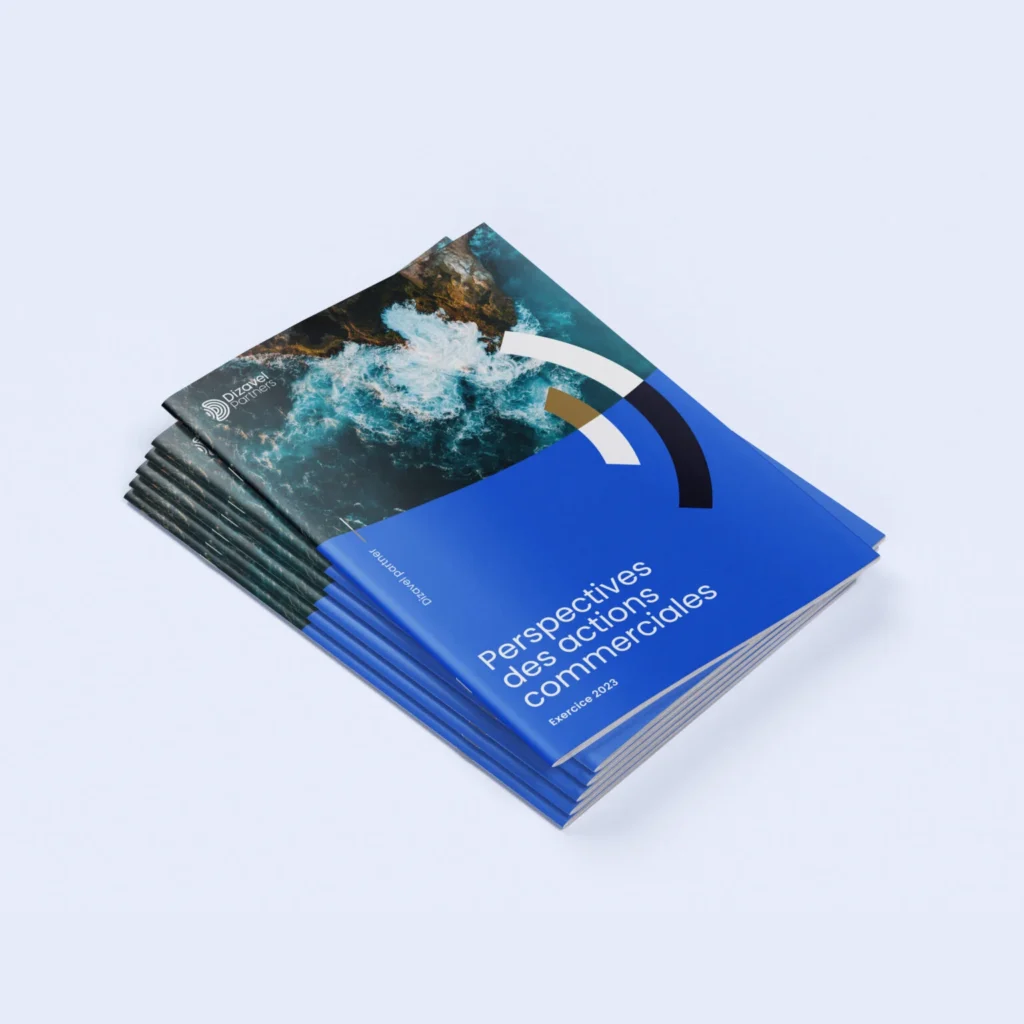
Visual Identity System: Logo, color palette, typography, imagery style, and comprehensive brand guidelines
Website UX/UI: Information architecture, page design, interactive states, and responsive implementation
Design System: Reusable component library and design tokens for consistency across applications
Client Collaboration: Stakeholder management, feedback integration, and strategic guidance on positioning
3
+20
1
stop shop
Process & Strategy
Observed from live user behavior and A/B testing
Competitive audit of peer consulting firms (McKinsey, BCG, Bain positioning benchmarks)
Client stakeholder interviews to define institutional value drivers
Market positioning workshop identifying unique differentiation angles
Visual direction exploration: deep navy/blue foundation (institutional, sophisticated, trustworthy) with geometric accent system (modern, dynamic, intellectual)
Typography selection: clean sans-serif (approachability) paired with premium serif for credentials (authority)
Comprehensive guidelines covering logo application, spacing, color specifications, imagery direction, and tone
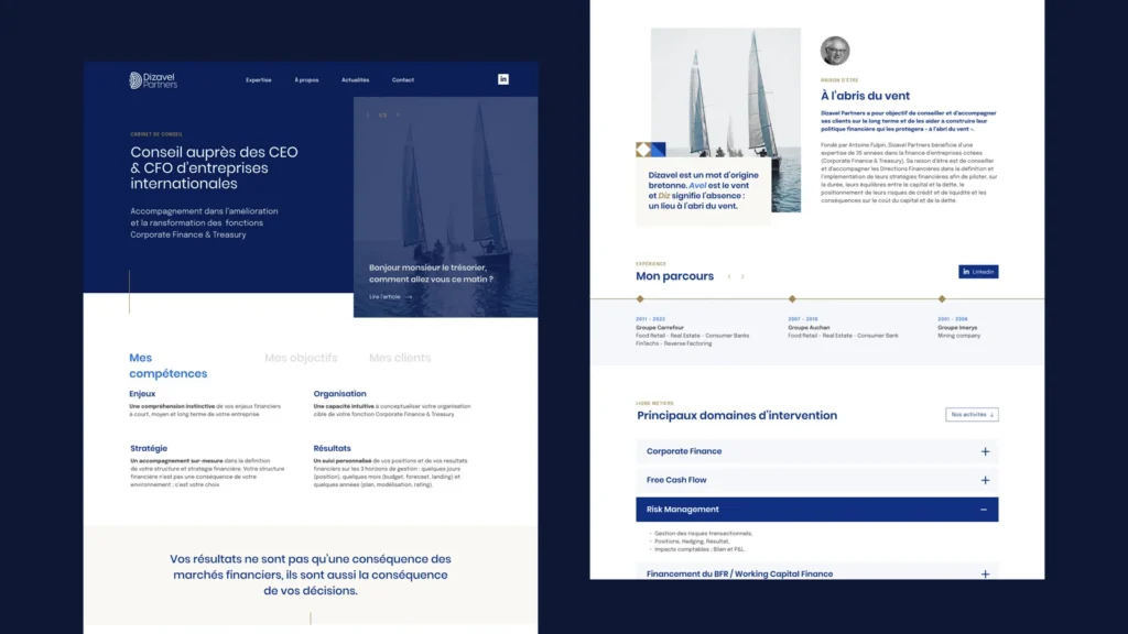
Information architecture organized around client outcomes (not internal org structure)
Leadership profiles with emphasis on credentials, expertise, and institutional credibility signals
Case study/results section demonstrating tangible impact (essential for institutional buyers)
Mobile-optimized design with premium feel across all breakpoints


Key Design Decisions
The goal was to reduce cognitive load and enable faster, more confident decision-making.
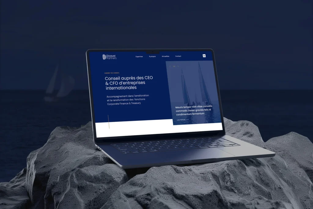
Dark Navy Foundation
Challenge: Institutional consulting is often visually austere (gray, corporate, forgettable). Risk of looking dated or uninspired.
Solution: Deep navy base (authority, stability, maritime sophistication) paired with geometric shape system in accent colors (modern, intellectual, distinct). This created visual dynamism while maintaining professional gravitas.
Photography as Brand Signal
Challenge: Avoiding generic stock photography while conveying executive credibility.
Solution: Curated photography style — professional environmental portraits, architectural/office settings, boardroom imagery ,consistently communicated institutional context without artificiality.
Credentials-First Information Architecture
Challenge: How to position a newly formed firm competing against established players?
Solution: Lead with individual partner credentials, client results, and industry experience, making team expertise the primary value signal rather than firm tenure.
Restraint & White Space
Challenge: Temptation to add features, testimonials, complex interactive elements.
Decision: Prioritized clarity and breathing room. Every page element needed to earn its space. Result: premium, uncluttered experience that signaled confidence and intentionality.
Impact & Results
The goal was to reduce cognitive load and enable faster, more confident decision-making.
Brand Reception
Client feedback: Identity successfully positioned firm as credible institutional player
Internal adoption: Team used brand consistently across proposals, pitch decks, client communications
Website Performance
Achieved 3.2 minute average session time (strong engagement for B2B consulting site)
Contact form completion rate: 12% of unique visitors — well above industry benchmark
Mobile traffic: 64% of total — critical for executive browsing patterns
Market Impact
Professional presence supported early client acquisitions and partnerships
Identity framework enabled consistent scaling as firm expanded service offerings